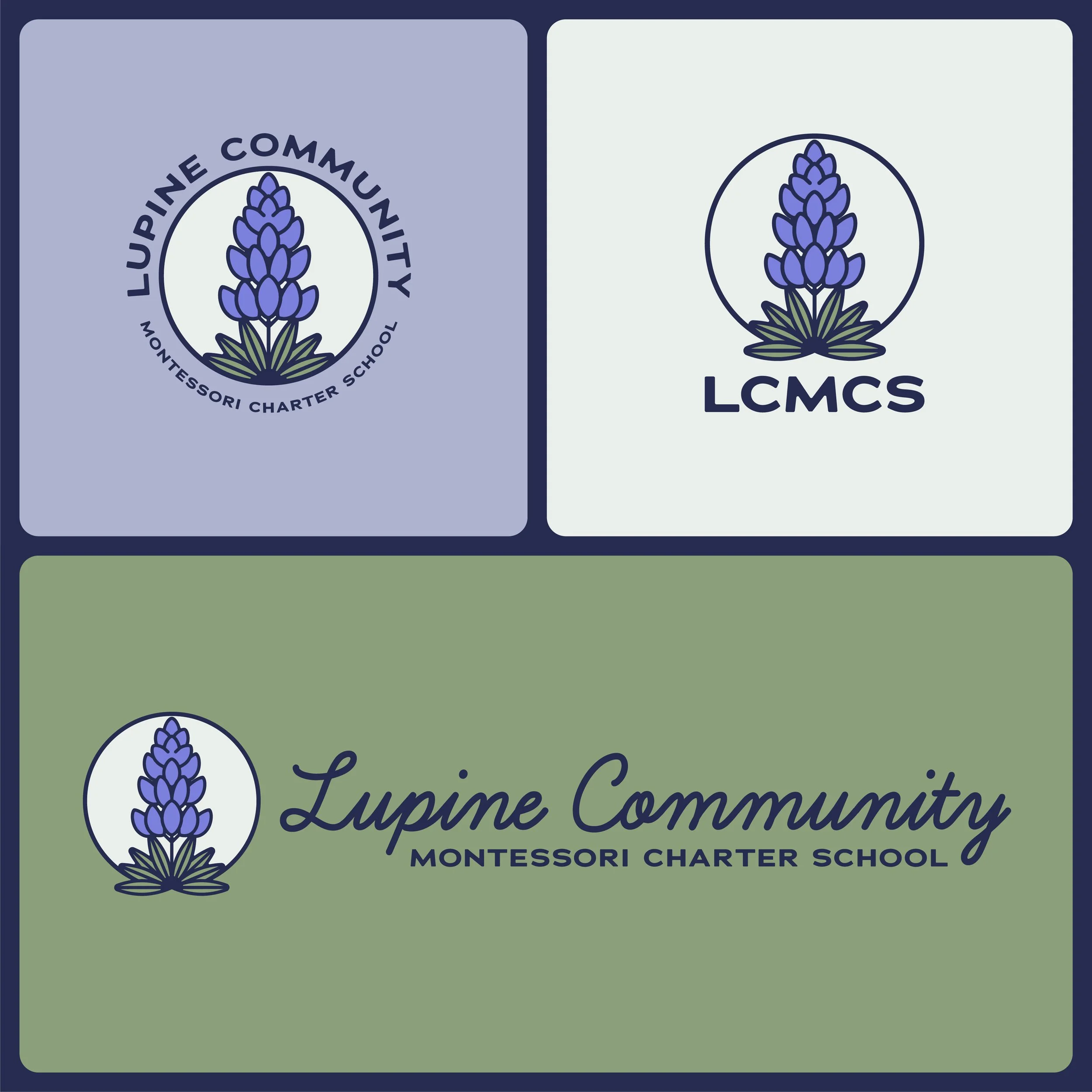
Lupine Community Montessori Charter School
Logo, Color Palette, Icons, Typography, Stationary
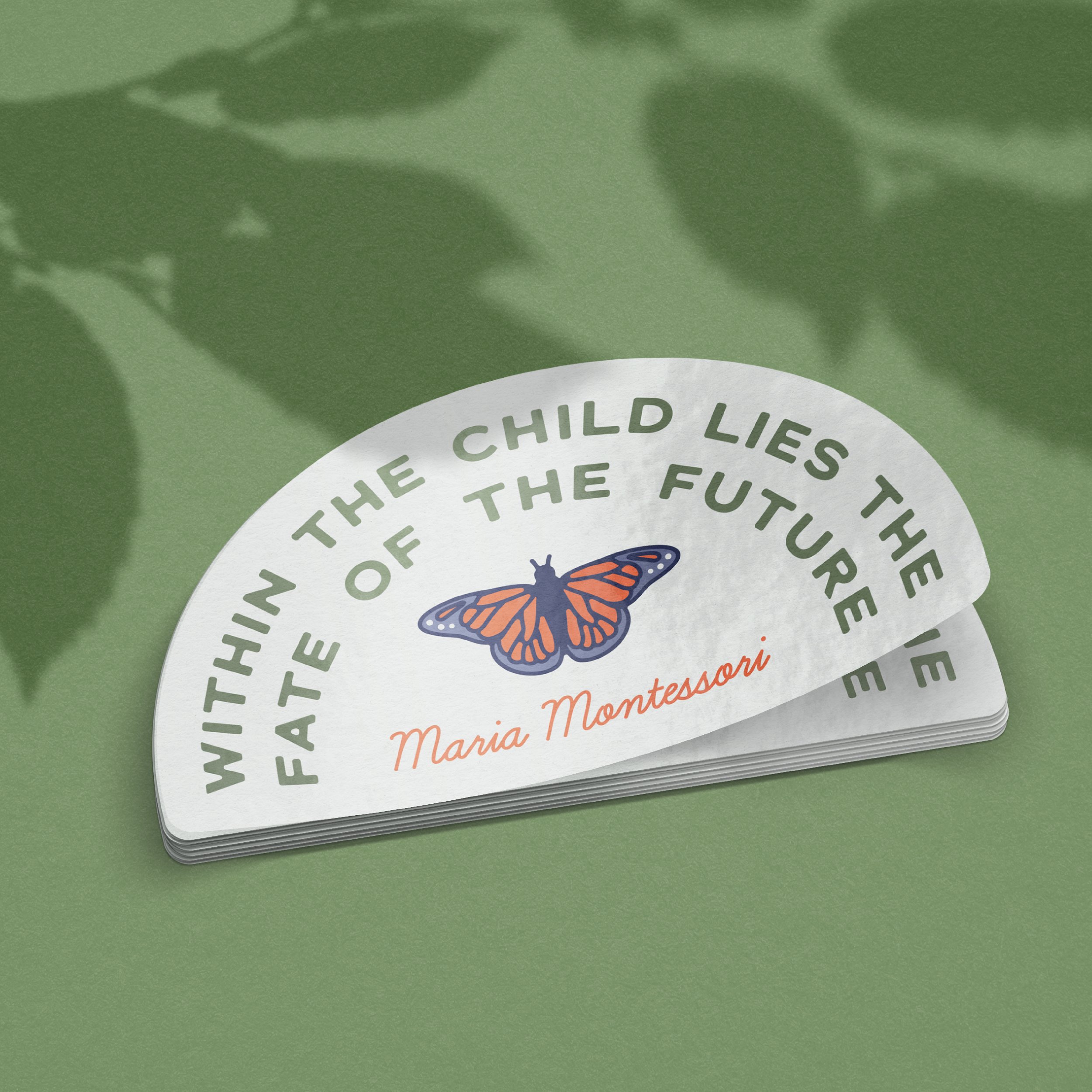
When my child’s Montessori charter school underwent a renaming, I led the design of a new logo and collateral to reflect its refreshed identity. The logo features a lupine flower, an integral part of the school’s new name, symbolizing growth, beauty, and connection to nature. Inspired by the Montessori philosophy of curiosity, exploration, and hands-on learning, the color palette and supporting icons were drawn from natural elements and the sense of wonder found in early education. The result is a warm, approachable visual identity that honors the school’s values and invites families into its learning community.